


Own What Matters
Altariss
Context
Altariss is a selective membership that gives qualified buyers collective negotiating power over pre-construction residential real estate. Members buy together and own individually: bulk-negotiated terms on the way in, full control of the unit once it is theirs, and no pooled liabilities on either side.
The proposition is unusual enough to need careful explaining. A membership that negotiates as one but holds title separately sits between two things buyers already understand and belongs to neither. Most of the design problem was making that distinction legible in the first thirty seconds.
The audience is not one audience. Domestic investors, international buyers, family offices, tax and legal advisors, wealth managers and real estate professionals all arrive with different questions and different reasons to be sceptical. The site routes each of them to their own case rather than asking them to translate a generic one.
The register throughout is investor-first. Evidence before adjectives, the track record stated plainly, and none of the ornament luxury real estate usually reaches for. It reads as an institution that does not need to announce its prestige.
In Image
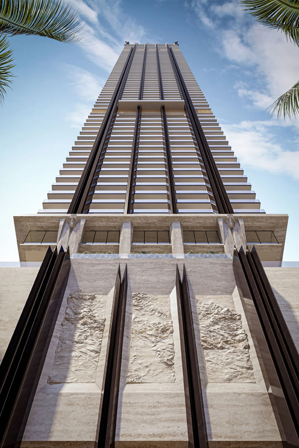
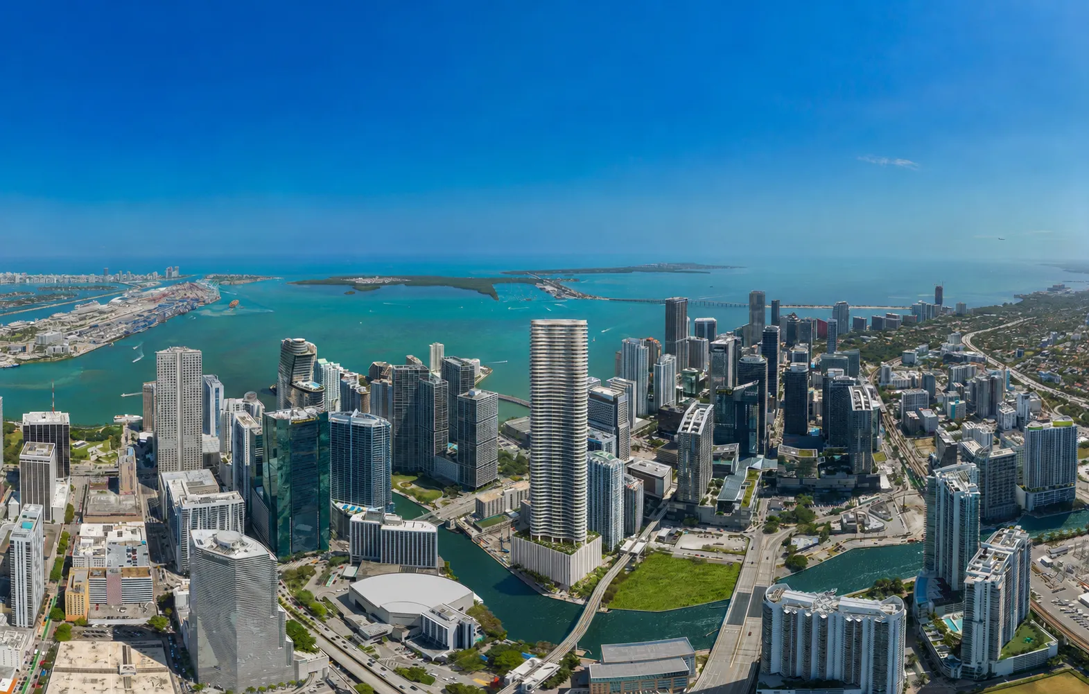


In Motion
Deliverables
Site & Members Portal
Investor-facing site with a routed path for each buyer profile, plus the members portal carrying inventory, financial analysis and concierge services
Brand System
Identity carrying the move from Altariss to Altariss, applied across the platform, membership materials and every investor touchpoint
Advertising & Collateral
Advertising, event and development materials built to hold their register in front of an audience that has seen everything
Typography
Canela
PP Mori
Client Testimonial
"James has been a trusted creative partner across everything we do, from the site to the campaigns to the launch materials. The work consistently represents TCS at the level our clients expect."

Simon S. Mass
CEO, Condo Store Group of Companies
