


Care Reimagined
1Med Healthcare
Context
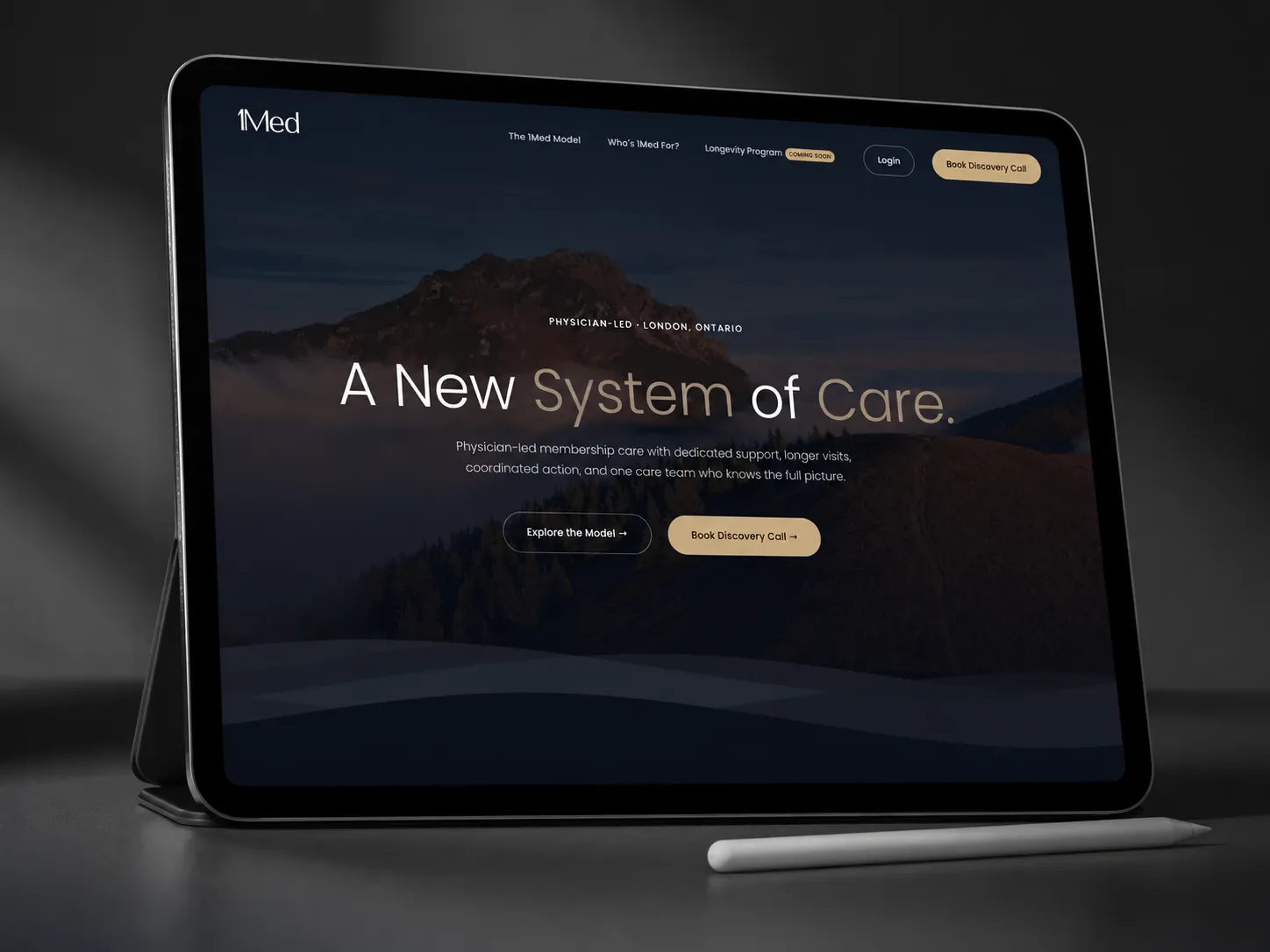
1Med is a physician-led membership practice based in London, Ontario, built around a single premise: that people deserve healthcare that is proactive, personal, and actually built around them. When Dr. Kirk Hollohan came to us, the vision was clear: the existing digital presence simply could not carry the weight of what they were building.
The brief required navigating a sensitive intersection: a site that had to feel premium and trustworthy enough for patients making significant health decisions, while clearly communicating a sophisticated medical model to an audience that includes both physicians and discerning individuals looking for a different standard of care.
We built the site around 1Med's core philosophy: precision, continuity, and trust. The typographic system pairs Cormorant Garamond's editorial elegance with Inter's clinical clarity. Deep navy anchors the palette, supported by sage and gold accents that bring warmth without compromising authority. The result is a digital presence that reflects the quality of care behind it.
Deep Navy
#1A2332
Slate
#3D5166
Sage
#7A9E87
Warm Gold
#C9A96E
Cream
#F5F0E8
In Image




Deliverables
Identity System
Visual identity, colour palette, typography system, and brand standards for a premium medical practice
Full Build
Custom designed and developed website communicating the 1Med model to physicians and prospective members
Patient Journey
End-to-end user experience designed to inform, build trust, and guide visitors toward booking a discovery call
Typography
Cormorant
Inter
Client Testimonial
"They understood the stakes of healthcare and delivered something we're genuinely proud to put in front of physicians. The site communicates exactly what 1Med is: precise, trustworthy, and built around the patient."
Kirk Hollohan, MD
Founder, 1Med Healthcare
